Sunday, July 26, 2015
Monday, July 13, 2015
#Freelance_Talents News
*) - Hi guys! We wanted to share some of our 3d models with you. We hope you like them and that you will find them useful. Feel free to use these 3d models and share the link to them as well as this post. You can expect more free models in the future.
You can find out more about the project and download free 3d models on this link: http://on.be.net/1NYvhLp Cheers!
Project Title: DIESEL STUDIO
Project type: Personal project.
Software used. 3ds Max, Marvelous Designer, Vray, Photoshop
---------------------
*) - Cyril Sinel - "A picture I did for Steampunk Tendencies some weeks ago, I do mostly concepts, but tried to spend some time on this illustration, so any critiques would be super welcome."
-------------------------
*) - Artist - Lara Chernyvolk
-------------------
*) - Perspective Drawing Tutorial
Anyone can learn the basics of perspective drawing, and with the few simple rules described in this art tutorial you'll become able to add the power of perspective to your own art. If you've ever read a Spiderman comic (or any other comic with an urban setting) you should be quite familiar with perspective drawings of tall skyscrapers reaching for the clouds above, or Spidey standing on a rooftop looking down at the disappearing streets below. Typical comic book scenes like those all take advantage of the rules of perspective drawing, and it's stuff like that we will have a closer look at in this beginners art tutorial. With that in place let's move on!
1-Point Perspective Drawing
Lets start with a simple 1-point perspective illustration. Imagine you're looking down a street with buildings on each side. Notice how, by using only a few nifty techniques, a basic single point perspective adds a great sense of depth to an otherwise plain illustration. The horizontal black line at the bottom is called the horizon and the dot in the center is the vanishing point where all the lines adding depth converge. The eye level in this illustration is close to the ground but could easily be placed up higher if we wanted. That's 1-point perspective. Lets move on and have a look at a 2-point perspective illustration.
2-Point Perspective Drawing
Again we're placed at ground level (our eye level). This time we're looking at a single building rise above us. As you can see we now have 2 vanishing points. All the vertical lines of the skyscraper eventually meet at the same point located above the building. That's vanishing point 1. The lines giving the building a sense of depth all meet at vanishing point 2. That's 2-point perspective. Lets move on to the final part where we'll add one more perspective to our building.
3-Point Perspective Drawing
Here we're looking at our building from above. The vertical lines all meet at the same single point below. The lines of the rooftop continue in two different directions where the lines will eventually converge far beyond the boundries of our illustration. That's 3-point perspective.
A Few More Words
There you go. The basics of perspective drawing. Naturally things will become far more complicated as you add more buildings and details, and even more so if you add buildings and objects oriented differently than the others. But I suggest you start out with these basic setups and then move on to more complex scenery adding more buildings and details, and when you're ready and have the basics nailed you can step up your game making entire cityscapes or scenery with similar complexity. #tutorial#freelancetalents #freelance_talents #art #drawing
Tuesday, July 7, 2015
Art Tutorial (Normand Lemay) #freelance_talents
I use this a lot when storyboarding a first pass of a sequence. Placing hands in the right, most appealing position can be tricky. In order to create a clear silhouette for the hands, I often draw them “floating in the air”. Then, using my general knowledge of anatomy, I just “fill in the arms”. This way I can create a much more expressive and clear pose than if I was just radiating out of the torso. That’s when structure and anatomy can get in the way of a clear message. And hands carry a lot of meaning, so I want to make them as clear as possible for my audience to see them.
I would say the same applies to life drawing. Since they often don’t carry the body weight (legs most often do), I feel like i can take the freedom of changing their position slightly to make a better visual statement. #art#tutorial #freelance_talents
Thursday, July 2, 2015
Freelance Talents #level_up
Artist - Naufal Azka
Patrick Deza - "What is it that makes an image look good? I think it's the composition. What do you think? -30 minutes, no refs..."
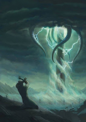
Robson Michel - "Lovecraft inspired piece...
Hamza Suraj Bajwa - "Trying my hand at some medieval architecture."#freelance_talents
Subscribe to:
Posts (Atom)


